UI Guide: 7 Principles for Web Pages and Landing Pages
A page can look good at first glance and still be difficult to use. The heading gets lost, elements seem randomly placed, buttons change appearance from one section to the next, and the order of information becomes unclear on a small screen. Often, the problem starts with the fundamentals: structure, sizing, spacing and consistency.
This UI guide for web pages and landing pages explains seven principles for creating a clear interface. The visual examples from the reference material show how elements relate to one another; the values shown are starting points, not mandatory rules. Apply the principles to suit your content, the action you want people to take and the people who will use the page.
Build your page from sections with clear purposes
One main message for each area
Before choosing colors or button shapes, decide what the visitor needs to understand. The first section introduces the subject and sets the direction. Later sections can explain the offer, show examples, address concerns or help someone make a decision.
A useful section has a purpose you can describe in one sentence. “This is where we explain the main benefit” is more helpful than “This is where we put three cards.” Decide how many cards you need and what they should look like once the message is clear.
On a landing page, the sections may lead toward a single main action. An overview page can offer several paths to explore. In either case, readers need a logical sequence that does not jump between unrelated topics.
Group elements that belong together
Think about structure at three levels: the large sections of the page, the area that aligns their content, and smaller groups of related elements. A heading, paragraph and button that communicate the same message form a group. An image and its explanation form another.
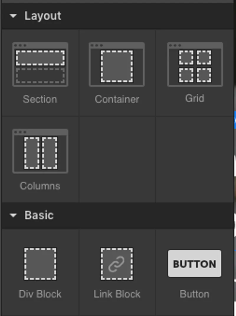
This separation helps preserve visual relationships as the page gets narrower. A button should not become detached from the message it refers to simply because other elements change position.
Keep content within a consistently aligned area
Maximum width and centering
A section background can span the full screen while its text and images stay within a central area. This shared boundary gives the page structure and stops content from stretching too far across large screens.
The PDF example uses a maximum width of 1,160 pixels. This is an illustrative value. The right width depends on information density, text size and how many elements sit side by side. A gallery may need more space than an article.
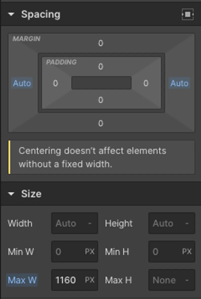
Centering becomes visible when the content area is narrower than the available space. On small screens, leave enough room at the sides so text and buttons do not touch the edges.
Use shared alignment guides for navigation and content
Compare the positions of the logo, main heading, first card and footer information. If they belong to the same structure, align them to shared guides.
You can make exceptions for a large image or an element that deserves emphasis. Give each exception a clear visual purpose. When every section starts in a different place, readers have to keep working out how the page is organized.
Choose dimensions that adapt to the content
Minimum and maximum limits
Sizing involves more than width and height. Minimum and maximum limits help you maintain balance without forcing elements into a rigid shape.
| Decision | What it controls | What to check |
|---|---|---|
| Width | The space used horizontally | Does the element fit the available area? |
| Height | The space used vertically | Does all the content remain visible? |
| Minimum limit | How small an element can become | Is it still readable and easy to use? |
| Maximum limit | How far an element can expand | Are proportions and visual order preserved? |
A fixed-height card may look tidy with two lines of text but cut off a longer heading. Let the content determine the height when its length can vary. For images, choose suitable proportions and check what gets lost when they are cropped.
Different screens, the same logical order
Some dimensions need to stay stable; others should respond to the available space. An icon can have a consistent size while the main content area expands up to a limit.
Test the page at several widths, including sizes between a typical phone and desktop screen. Look for awkward heading breaks, images that become too small and elements that extend beyond the screen. Also check what happens when someone increases the text size.
A successful adaptation preserves the meaning and priority of the information. Making everything fit is only part of the job.
Use spacing to show relationships
Space inside and outside an element
Inner spacing separates content from the edge of its element. You see it between a button label and its outline, or between a card’s content and the edges of its background.
Outer spacing separates an element from its neighbors. You see it between two cards, between groups of information or between sections.
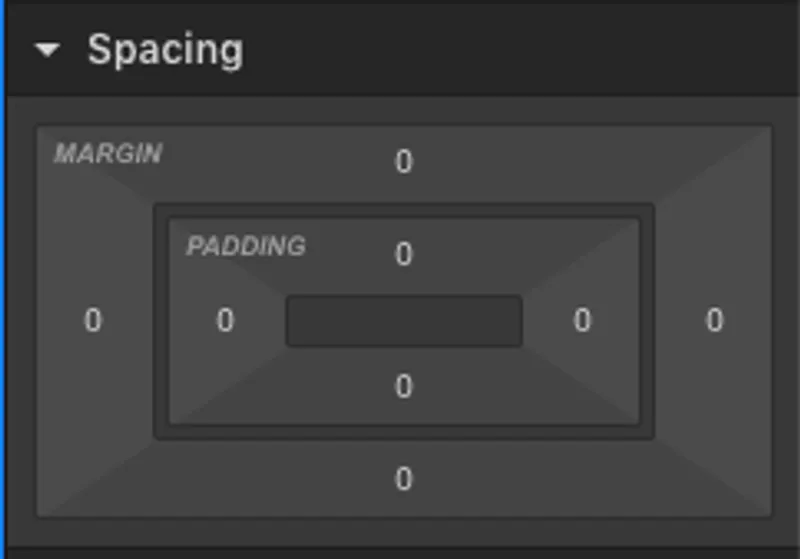
The distinction matters in practice. If text sits too close to a card’s border, increase the inner spacing. If two cards look stuck together, adjust the distance between them. Changing the wrong value can simply move the problem somewhere else.
Use a consistent spacing scale
Choose a small set of spacing values and reuse them. For example, you might start with 8, 16, 24, 32 and 48 pixels, then adjust them to suit your text size and the density of the page.
Use smaller gaps between closely related elements and larger gaps between separate groups. A card heading should feel closer to its own description than to the next card. Empty space then communicates a relationship instead of acting only as decoration.
Define reusable visual styles
A clear hierarchy for headings and text
Decide how the main heading, section headings, subheadings and body text should look. Differences in size, weight and spacing should help readers recognize the levels of information.
Avoid emphasizing everything at once. If the heading, label, price and button all compete equally, nothing guides attention. Decide what people should notice first and support that priority through contrast and position.
These relationships are also explained in Nielsen Norman Group’s guide to visual hierarchy: size, contrast and grouping help people distinguish the relative importance of elements.
Give elements with the same role a consistent appearance
Two primary actions should be recognizable as part of the same visual family. Establish shared rules for buttons, cards, fields and labels, then introduce variants when their roles differ.
For example, a primary button might have a solid background, while a secondary action uses a more subtle treatment. Avoid changing shape or color from one section to another without a reason.
When you adjust a shared rule, check every place it is used. A change that works for a short button label may produce a different result with a longer one.
Arrange elements around the reading flow
Rows, columns and wrapping onto another line
Elements can sit side by side or stack vertically. The choice depends on their relationship and the available space. Two pieces of information that need comparison may work well alongside each other; a step-by-step explanation needs an obvious sequence.
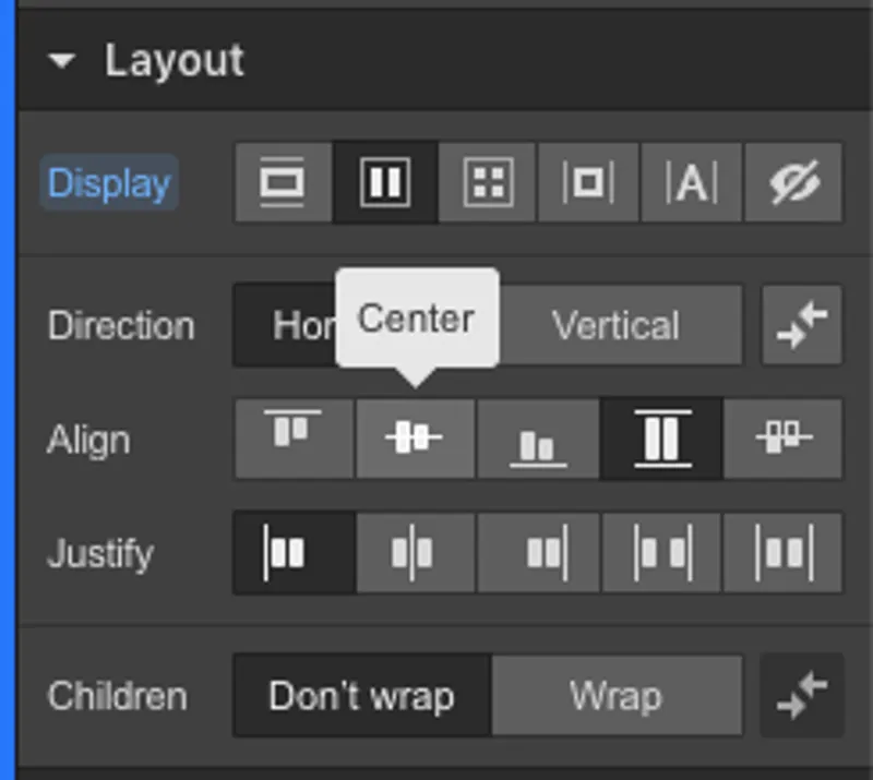
Decide how elements align, how much space sits between them and when they move onto another row. For cards with different amounts of text, check that headings and actions still follow an easy-to-understand pattern.
Keep the content order clear on mobile
When two columns become one, the order of the elements should still tell the same story. A benefit and the image that explains it need to remain easy to connect.
Group elements by meaning before changing the direction of the layout. If you place every heading, image and button at the same structural level, their relationships can get lost on a narrow screen.
Make navigation and interactions easy to understand
Clear menus and predictable actions
Use labels that describe the destination or action. “View projects” tells people more than “Discover,” while “Send request” makes it clear what will happen after they complete a form.
Keep navigation aligned with the rest of the page and give each option enough room. On small screens, people should be able to open, use and close the menu without overlapping elements blocking the content.
Visible states for hovering, pressing and keyboard use
An interactive element needs more than a default appearance. Show when it can be activated, when it is being pressed and which element currently has focus during keyboard navigation.
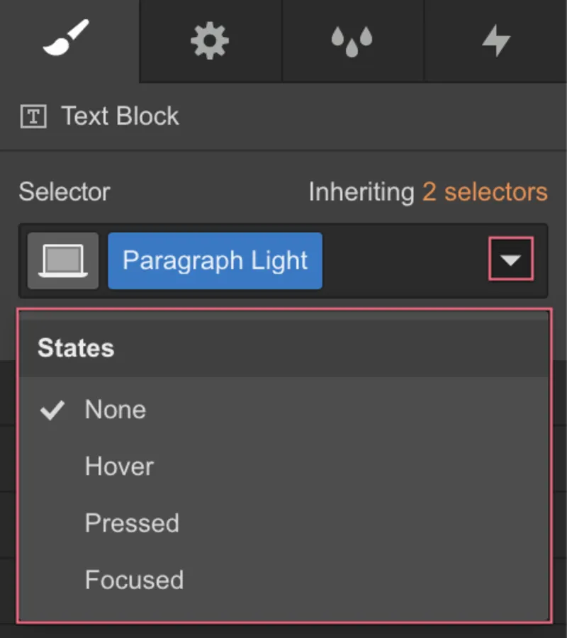
A hover change is not enough: a touch screen does not offer the same interaction. The label, shape and position should provide clues in the default state too. For keyboard navigation, keep a clear focus indicator that remains visible against the page background.
Subtle transitions with a purpose
A short transition can make a state change easier to follow. The PDF includes a 200-millisecond example. Treat it as a starting point for testing, not a universal duration.
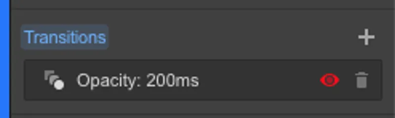
Animation should explain a change or confirm an action. Avoid continuous movement next to text that needs attention, and keep the experience coherent when animations are reduced. A button should respond immediately without waiting for a decorative effect to finish.
Review the page before publishing
Go through the page as someone seeing it for the first time. Can you understand the subject and the main action without reading every paragraph? Then check the details:
- Each section has a clear purpose and follows logically from the previous message.
- Navigation, headings and content use consistent alignment guides.
- Long text and images stay within the available space.
- Spacing shows which elements belong to the same group.
- Headings, buttons and cards follow shared visual rules.
- The information remains in a logical order on narrow screens.
- Actions are clear when using touch, a mouse or a keyboard.
- Transitions support interaction without hiding information.
Test with real content. A layout that looks balanced with sample text may run into problems with a long heading, a different image or a more descriptive button label.
Frequently asked questions about UI best practices
Do the same principles apply to websites and landing pages?
Yes. Clear structure, alignment, spacing and consistency help in both cases. The purpose of the page and the way information is distributed may differ. A landing page often focuses on one main action, while other pages may support exploration of several topics.
What is the difference between a section and its content area?
A section defines one part of the page and can have a full-width background. Its content area determines where the text, images and actions align inside it. Separating the two allows for expansive backgrounds while keeping information easy to scan.
Should I always use a maximum width of 1,160 pixels?
No. That is the value used in the visual example. Choose a width that suits the content and check the result on different screens. Long-form text, a product listing and a gallery may need different widths, even on the same website.
How do I choose between inner and outer spacing?
Look at the relationship you want to change. To adjust the distance between content and its border, change the inner spacing. To separate an element from its neighbors, change the outer spacing. Then review the whole group, not just the individual element.
How can I stay consistent without making every page identical?
Reuse rules for typography, spacing and interactive elements. You can vary the composition, imagery and rhythm of the sections to suit the message. Consistency means familiar behavior and visual cues, rather than repeating the same page.
Is changing a button’s color on hover enough?
No. A button should be recognizable in its default state, communicate its action and have a visible focus state for keyboard navigation. Also test touch interaction, where hovering does not provide the same cue.
A clear page starts with simple rules
A coherent interface comes from decisions that support one another: purposeful sections, aligned content, flexible dimensions, intentional spacing and predictable interactions. Use this UI guide at the start of a project and return to it when reviewing the page with real content. The goal is to help people understand what they see and continue without hesitation.